Top Interior Colors Boosting Resale Value in Upscale Markets

Buyers shopping in upscale neighborhoods pay close attention to every surface. They walk into a home expecting style, comfort, and immediate livability. Paint color is often the first impression, setting the tone for the entire visit. Choosing well can shorten time on the market and increase offers. Picking the wrong colors can stall a sale. Neutral walls and sophisticated accents speak to these buyers because they suggest move-in readiness. That's why interior colors boosting resale value matter more than ever in high-end markets.
Neutrals with a Twist: The New Classics
Classic neutrals like white and grey still have their place, but today’s buyers often look for something with a bit more personality. Shades such as beige, mushroom, and creamy taupe bring warmth and style while staying versatile enough to suit many tastes. These colors work beautifully in living rooms, hallways, and open spaces, bouncing natural light around without making the area look cold or empty.
Warm taupe, for instance, adds a richness that flat grey can’t match. Mushroom tones shift subtly with the lighting, pairing nicely with both cool and warm furniture. Creamy ivory is also a smart pick for kitchen cabinets or trims, offering brightness without the stark feel of pure white.
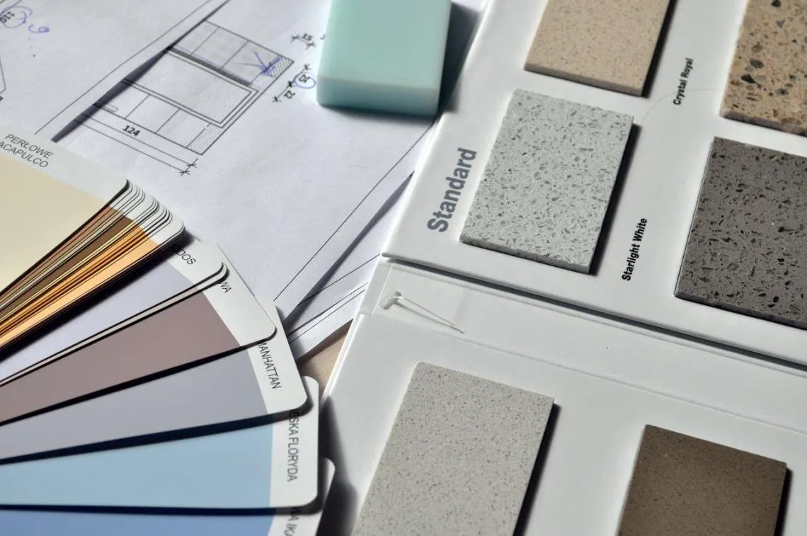
However, before adding these new hues, it often pays to clear out bulky furniture or personal items. That’s where renting a storage unitcomes in handy. It gives you the freedom to move belongings out temporarily, making painting and staging far simpler. Plus, an uncluttered home highlights the beauty of these modern neutrals, showing buyers just how spacious and stylish your place can be.
Interior Colors Boosting Resale Value in Today’s Luxury Market
Many real estate professionals agree that interior colors boosting resale value are tied to broad appeal. White Dove, Revere Pewter, and Pale Oak appear in thousands of high-end listings because they photograph well and feel clean. Buyers see these shades as safe and updated. They won’t need to repaint right away, which lowers their perceived to-do list.
In addition, soft greys and warm off-whites create a sense of quality without making the space feel sterile. These colors help highlight expensive features such as marble counters, wood floors, or custom built-ins. They don’t compete with furnishings and work in both traditional and modern interiors.
Blue Tones That Calm and Sell
Blue is popular in upscale interiors, but only certain shades work well. Soft sky or powder blue adds a clean, airy feel to bathrooms and creates a calming touch in bedrooms. In contrast, deeper tones like slate or steel blue bring depth and maturity to offices or guest rooms. These colors pair nicely with white trim, brushed metal, or light oak flooring.
Bear in mind that buyers connect with homes that feel comfortable, and blue supports that—when used carefully. Apply it in bedrooms or studies to add contrast without making the space feel cold. However, avoid using it throughout the home. In larger rooms, blue can darken the space unless balanced with pale floors and ceilings.
Earthy Greens for a Natural, Upscale Vibe
Green tones have become more common in luxury listings, especially muted shades. Sage, olive, and eucalyptus bring calm into the space without going too bold. These tones hint at nature and wellness, both of which appeal to upscale buyers focused on lifestyle.
Importantly, sage green works well in bedrooms and bathrooms. It feels gentle and clean, especially when combined with white counters or linen textures. Olive is often used in kitchens or living areas with natural wood features. It gives an earthy depth that pairs well with warm finishes.
Clary Sage by Sherwin-Williams or Back to Nature by Behr are popular choices. These colors make a home feel cared for and well-designed. In staging photos, they look current without being trendy. That helps potential buyers see a space that feels relevant but not overwhelming.
Off-White and Creamy Tones That Reflect Light
Off-white is a favorite in luxury homes because it works in every room. Unlike true white, which can feel cold, these creamy versions add depth and reflect light more softly.
Simply White or Alabaster create a polished base that flatters wood floors, crown molding, or modern furniture. These shades work especially well in homes with lots of windows, where they enhance natural light. They also help small rooms appear larger.
In kitchens, creamy white makes cabinetry appear custom and high-end. In open concept spaces, it creates cohesion between dining, living, and cooking areas. That’s key when buyers are looking for flexibility and elegance.
Avoid pairing creamy tones with bright white trim unless you’re sure they match. A mismatch can look dingy or accidental. Instead, use the same undertone for all surfaces. These tones rarely offend or overwhelm. That makes them ideal for upscale buyers who expect understated quality.
Accent Walls Done Right: Where Bold Still Works
Some bold colors still appeal in specific spaces. Accent walls allow for expression without sacrificing resale appeal. Deep navy, charcoal, and forest green add contrast and help define spaces in larger homes.
Media rooms, dining areas, or powder rooms are the best locations for these choices. A dark wall in the dining room, paired with a light ceiling and trim, can add drama without making the room feel small.
Powder rooms are another good option. These small spaces give you the freedom to go bolder. Buyers often enjoy seeing personality in these tucked-away areas. Just avoid using bold colors in large or main rooms, as they can limit the home’s appeal.
If you choose an accent wall, make sure the furniture and lighting support it. A poorly lit dark wall can make a space feel enclosed or unfinished. Keep the rest of the home neutral if using bold colors in select spaces. That ensures a consistent, polished feel overall.
Why Color Strategy Pays Off in Upscale Sales
High-end buyers make quick judgments. The right shades make a home look brighter, cleaner, and more spacious. Interior colors boosting resale value help listings stand out without the need for expensive updates. These tones also signal move-in readiness, which can limit negotiations and lead to better offers. Subtle, timeless colors work best—avoid anything bold or overly personal. Choosing the right paint is one of the easiest and most cost-effective ways to increase appeal and attract serious buyers. In luxury sales, color isn’t just visual—it’s a smart selling tool.